The hand lettered title for the 1954 film “Power of the Press” was done in a condensed sans serif type style that is now available digitally in both regular and oblique versions as Local News JNL.

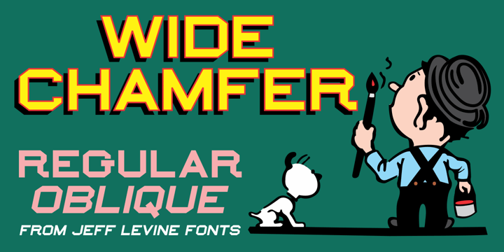
Inside the pages of an untitled sign painting textbook (circa 1902) was an example of the classic chamfered sans serif alphabets used by tradesmen of the time.
This version was wider than most, and perfect for a digital version called Wide Chamfer JNL, which is available in both regular and oblique versions.

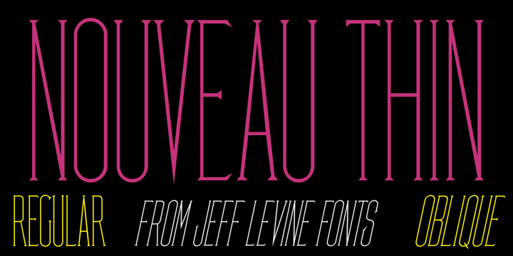
A condensed, light face spurred serif alphabet was shown on an antique catalog page from Spon & Chamberlain Publishers as “French”. The catalog likely sold tools and dies to stonecutters for making inscriptions in marble, granite and so forth.
This elegant design is available digitally as Nouveau Thin JNL in both regular and oblique versions.
©
Frida Bezrukova
2014 . Powered by
Blogger
Blogger Templates
.
.